Monday August 6 - click here
Monday, August 2, 2010
Class Paintings of Facebook
I have posted a number of the class paintings on my watercolor class facebook page. Here are the links:
Friday, July 23, 2010
Transparent Glass Class
We had a great time today working on still lifes with glass objects. I've posted eight of the class paintings at http://www.facebook.com/album.php?aid=19226&id=125192950848216&saved
Monday, July 19, 2010
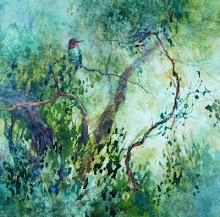
Painting Trees at SWA
This last weekend I conducted a three day workshop for the Society of Western Artists focusing on effective watercolor techniques for painting trees, branches and foliage. Here I am demonstrating on canvas.
 And here are a few of the artists working away. We really did have a good time and I know I learned A LOT! I've put examples of some of the paintings on Facebook.


Tuesday, July 13, 2010
Traveling Conversations

Here's one shot from our reception with Jean and Terri H. and friends. And below is a shot of the 'sketchbook' wall without the crowd in front. Sixty nine paintings from over five years!

Monday, July 12, 2010
New Class Session in Menlo Park
We started a new set of classes at Little House today. We really had some interesting paintings develop from our playing around. I posted 5 of them on the class facebook page - the link is below.
Sunday, July 11, 2010
Conversations Workshop
We had a great time at McCellan Ranch for our workshop and just perfect weather. Here are a few of the participants busy creating.


Here are a couple of the short 'conversations' we created-


Tuesday, July 6, 2010
Join us on Friday in Los Altos | Art Reception
 This Friday is the reception for a five year long art project that I did with two of my best friends, Elaine Frenett and Jean Warren. Elaine and Jean are both professional artists and in 2005 they both moved away from the Bay Area. We wanted to keep our friendship strong and as we've always had our art in common we agreed to communicate through painting.
 The July 2010 show at Viewpoints Gallery is a collection of 70 paintings that were part of our ongoing 'conversation' from 2005 to 2010. What I like about this collection is the strong narrative thread that encapsulates a moment in time that we wanted to share with each other.
We hope that you'll join the three of us on July 9, 5pm to 8pm, at Viewpoints Gallery in Los Altos to help us celebrate the bond of friendship and art. The show runs through the end of July.
For fun we put together a book to compliment the show. It has all the paintings alongside a personal narrative for each one. If you're interested in this book it's available to order online. You can find it by clicking here: Traveling Conversations.
Hope to see you on Friday!
Subscribe to:
Posts (Atom)