Saturday, March 28, 2009
Lesson 36 - Light and Shadow on Buildings
Light and shadow shapes on buildings make a great tool in composing a design. For this exercise we put tracing paper over a photo of a sunlit building and traced out a pathway of light (sunlit shapes) or dark (shadow shapes). Tracing paper obscures details in the photo making it easier to see how value areas combine to make new, more interesting shapes which can lead the eye through a painting.
 Carla created a light area along the roof which joins the lighter grid trim which, in turn creates a pathway through the painting.
 The roof trim in Nancy's painting also connects to the light sky and the white in the foreground. The subtle, angled shadows make a nice contrast to the vertical - horizontal lines of the building.
 Lois used dark shapes to organize her design. Here, the green shadows tie in with the green roofs and bushes.
 Emily created a wonderful abstract dark design against a white background. Notice how the light and dark shapes are interconnected and how positive horizontal shapes in the upper portion are repeated as negative shapes for the tables.
Saturday, March 21, 2009
Lesson 35 - Positive/Negative Letters
Positive shapes are darker than the background; negative shapes are lighter than the background. A shape can also be darker than the background on one side and lighter on the other. It's an interesting problem to create shapes which go from positive to negative and to create text within these shapes which also gradate from negative to positive. Here are a few examples of what we came up with in class.
 Rita created a playful market scene with text grading from positive to negative and lost and found edges of rectangle shapes.

Joanne was able to grade her letters against a loose abstract background. I like the negative cat and dog shapes she added.
 Jan created a playful design of bright colored rectangles and text. The bright colors are repeated in the background and in the text and carry the eye through the painting.
 Celine worked with Chinese characters. The large one is positive on the right and negative on the lower left. The edges of some of the rectangles disappear the the loose under-painting shows through.
 Rita created a playful market scene with text grading from positive to negative and lost and found edges of rectangle shapes.
Joanne was able to grade her letters against a loose abstract background. I like the negative cat and dog shapes she added.
 Jan created a playful design of bright colored rectangles and text. The bright colors are repeated in the background and in the text and carry the eye through the painting.
 Celine worked with Chinese characters. The large one is positive on the right and negative on the lower left. The edges of some of the rectangles disappear the the loose under-painting shows through.
Sunday, March 15, 2009
Blackbird Painting
We are in a break between class sessions at the moment and I miss being able to show off what I have been working on. So I'm trying to document this month's painting as I go along. For this piece I knew I wanted to work with reds and Naples yellow and blue violet. I started with a wet in wet wash and a splash of color.

At this point I knew I wanted birds flying but not which kind. After several trials the obvious choice seemed to be Red-winged Blackbirds. Here they are blocked in.
 The next step was to work out a connection between the splash and the birds.
 I'll continue with this and post more next week.
At this point I knew I wanted birds flying but not which kind. After several trials the obvious choice seemed to be Red-winged Blackbirds. Here they are blocked in.
Monday, March 9, 2009
Friday, March 6, 2009
Class Critique
My classes are structured around a lesson challenge. Participants have roughly one and a half hours to work on a small (around 11" x 14") painting dealing with the problem presented. In the last half hour of class we take a look at what everyone has come up with. As you can see in the photo paintings are not displayed in mats and can be quite crowded together because we have a large group. Therefore, I enjoy being able to show a few of them on the web each week in a better format. But I love the variety of solutions people come up with to class problems and I love the way an individual's personality comes through in his or her painting - especially working under pressure.
Sunday, March 1, 2009
Lesson 34 Whimsical Portraits
Many people find portraits intimidating so for this exercise the goal was to have fun and not worry at all about achieving a likeness. We began by using photos which had been distorted in some way on the computer. Next we made a contour line drawing of the face by using a pen to draw around major shapes and lines of the image beginning at a focal point area. Finally we added watercolor washes to complete the study.
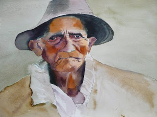 Teresa began with a photo which had been elongated horizontally so the shoulders and ears are way out of proportion. The resulting painting is still very appealing.
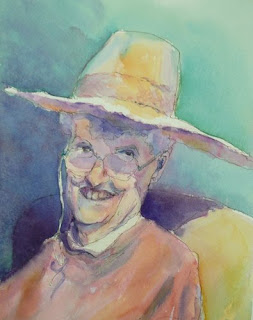
Nancy took a photo of a friend and elongated it vertically. She ended up with a wonderful, playful study built on opposing angles.
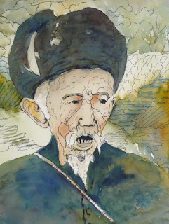
Jan used a 'pinch' function on her computer to squeeze in the features of the face and enlarge the hat. She added pen line texture in the background to compliment the wrinkles in the face.
 Leslie used bold pen lines to create an interesting division of space in a super close up of an elongated face.
 Teresa began with a photo which had been elongated horizontally so the shoulders and ears are way out of proportion. The resulting painting is still very appealing.
Nancy took a photo of a friend and elongated it vertically. She ended up with a wonderful, playful study built on opposing angles.

Jan used a 'pinch' function on her computer to squeeze in the features of the face and enlarge the hat. She added pen line texture in the background to compliment the wrinkles in the face.
 Leslie used bold pen lines to create an interesting division of space in a super close up of an elongated face.
Subscribe to:
Posts (Atom)
