Sunday, February 22, 2009

Lesson 33 Fog

The challenge in this lesson was to create a sense of low light and fog. We also wanted to have a feeling of depth in the painting.
First we considered color intensity. Colors become less intense as objects recede. We mixed complements to gradually decrease color intensity and found a variety of grayed colors to use. Too often painters rely on one neutral to create gray tones.

Second, we created a simple scene using these grayed colors, beginning with a wet-in-wet background. In the distance value contrast decreases and there are fewer details and softer edges.


Ruskin painted the background hills wet in wet to create lost edges. He was able to balance these shapes with small detail in the foreground.

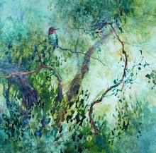
Sue set a figure in the distance by creating detail and stronger values in the foreground.

Rita let her trees disappear gradually into the distance. The detail and stronger hues in front bring the foreground forward.

Carol used wet in wet technique to create soft edges in the background shapes and more intense color in the foreground.

Sunday, February 15, 2009

Lesson 32 Creating textures using masking fluid

Masking fluid is often used to save white details in watercolor paintings but it can also be employed to create a variety of textures. For this lesson we experimented applying liquid mask with twigs, sponges, crumpled paper and anything else we could find to draw or stamp with. When the mask was dry we painted a simple landscape scene and used the textured areas to suggest foliage, flowers or trees. Here are some examples.


Celine dabbed mask in the foreground to suggest flower shapes and she also used it to create snow patterns on the mountains.

Alice drew fine lines of masking fluid to show ridges in the mountains and trees in the foreground.


Herching stamped on mask in different thicknesses to create a feeling of flower clumps receding.


Chris applied quite a bit of mask in the initial stages and was able to develop foreground detail as well as to suggest distant flowers

Saturday, February 7, 2009

Lesson 31 Drapery Folds

Cloth folds can be difficult of paint and, when poorly done, can ruin a still life painting. In this lesson we focused in on fold anatomy. The trick is to treat each fold individually and keep in mind that each change in direction, from horizontal to vertical for example, will need to be shown with a change in value. First we practiced making a graded wash to depict one fold and then set up a simple still life on folded fabric.


This is Ali's study of one fold. The stripe also helps to define the contours of the cloth.


Kazuyo buried her lemons in a crumpled white towel. It is an interesting problem to show folds on white fabric and still have it look white.


Sue set up a complicated fold arrangement in the lower part of her composition. The angular folds mimic the angular design on the bottle.


Bev worked with a darker piece of fabric. I like the way the fabric seems to recede into the distance in this painting.